§特殊时间可视化系列
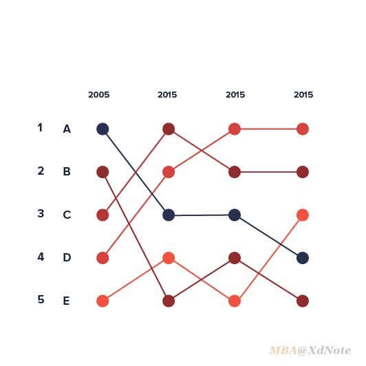
Bump Chart
凹凸图非常适合探索随着时间的推移排名的变化,可以轻松地比较多个观察值相对于彼此的 位置、性能或排名,而不是实际值本身。
通常以不同的颜色分类各个条目,并用同款的线进行各时间段,该节点所在位置的连接。
对于时间数据来说,最常见的可视化方法就是折线图。但是,由于时间数据太过常见,每行业都有其独特性。 对于一些特殊的数据,就可以通过一些特别的方法,让信息更好的传达。
Business Bump Charts – Deon Pollard's Weblog
Edward Tufte forum: Slopegraphs for comparing gradients: Slopegraph theory and practice
Data Deluge: The Earliest Ever Slopegraph? (1883)
Anna Powell-Smith
100 MOST VALUABLE BRANDS 2010/15 - Corriere della Sera on Behance
Print of Rank of states and territories in population at each census: 1790 - 18 Poster on Vintage Visualizations
Using a d3 voronoi grid to improve a chart's interactive experience | Visual Cinnamon
This is what Hip Hop's Billboard top 10 sounded like, back in 1995
Page not found – Creative Review
Most Popular Fields of Study, Since 1970 | FlowingData